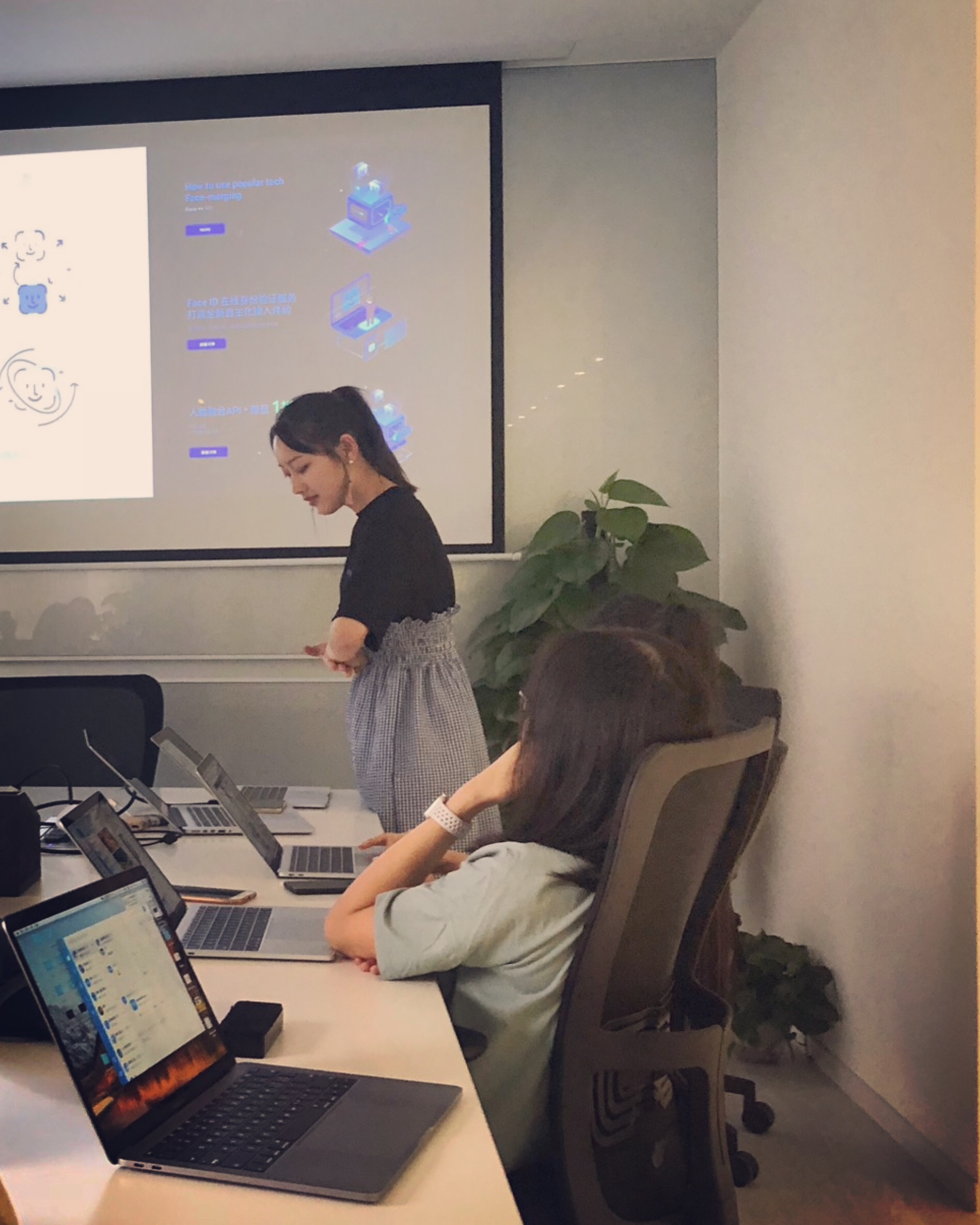
2018 Summer Internship
While traditional face recognition could suffer from faked faces and result in insecurities, Live Face Recognition is increasinly important in AI and being critical for government departments like public security and vulnerable corporations such as banks.
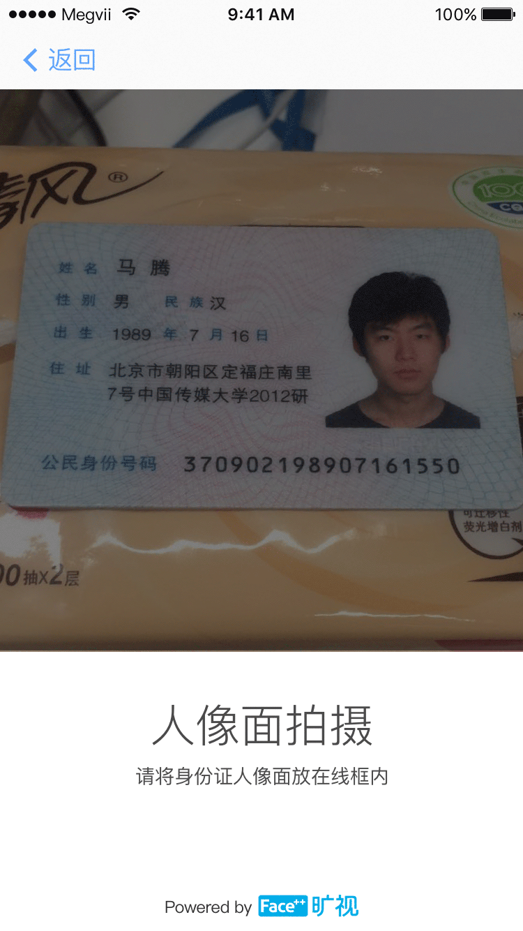
This project is to provide a setup process to our clients using this service to present to their users. It needs to take photos of users’ ID cards and to record videos containing users’ biological data for future verification. I worked upon my mentors existing user flows and wireframes. My duty is to help designing a UI that feels reliable yet approachable to the wide variety of user bases of the project.
Making UIs reliable is relatively straightforward. I made it looks formal and official, provided a clean user path, and added our company logo as endorsement. However, how to make it more intuitive for more users? A picture is worth a thousand words! I decided to create a bunch of friendly illustrations added to the UI as a visual guidance throughout the whole setup process. Here are them!


Since I just come to Face++, my visual mentor asked me to do is drawing a set of icon for website. They don’t like the old icon version serves for their web.
To me, these icons are not consistent with each other.In the first image, these lines are thick, but the second image’s icons’ line are much thinner. Besides, the style is totally different. Face++ as a scientific young company, the icons should looks more lively and vividly.But the old set is over-specific and realistic. It lacks of a way to reveal the sense about scientific.
I was trying to enhance scientific feelings for icon element. Firstly, to make the system more creative and vivid, I combined the line shape and the light blue shadow as overlapping. And each icon I add ”+” symbol to work in concert with our brand — Face++

People always imagine the future stuff in blue style. So I selected these three blue color to make it looks more fit in AI visual language. These blue works smooth and comfortable in our website but still showing a bit of sense about science. Also, the gradient dot with ”+” works well with the series icon, it makes the icon more like a image not only boring line.
 I also tested to cut down a part of elements in the icon like dot line, and light blue shadow to make this set works well in dark background.
![]()
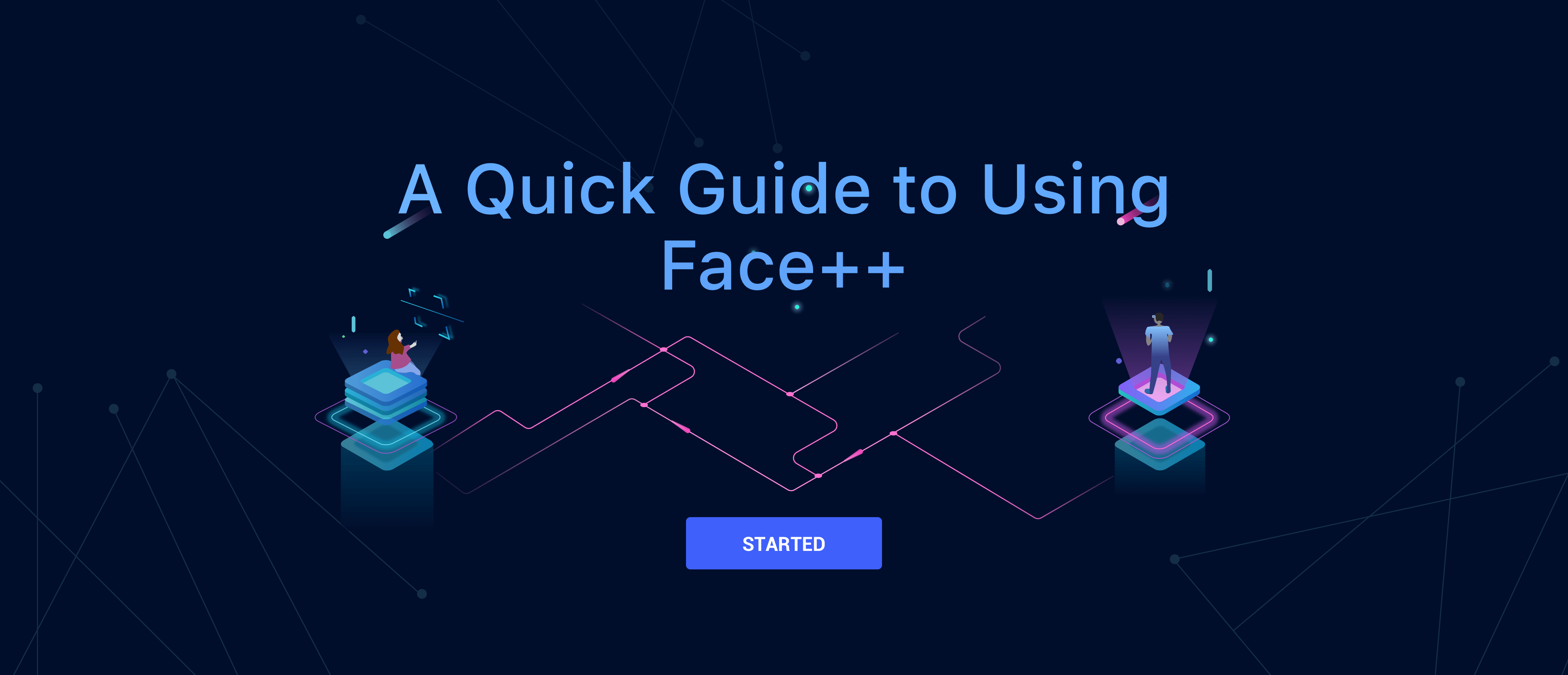
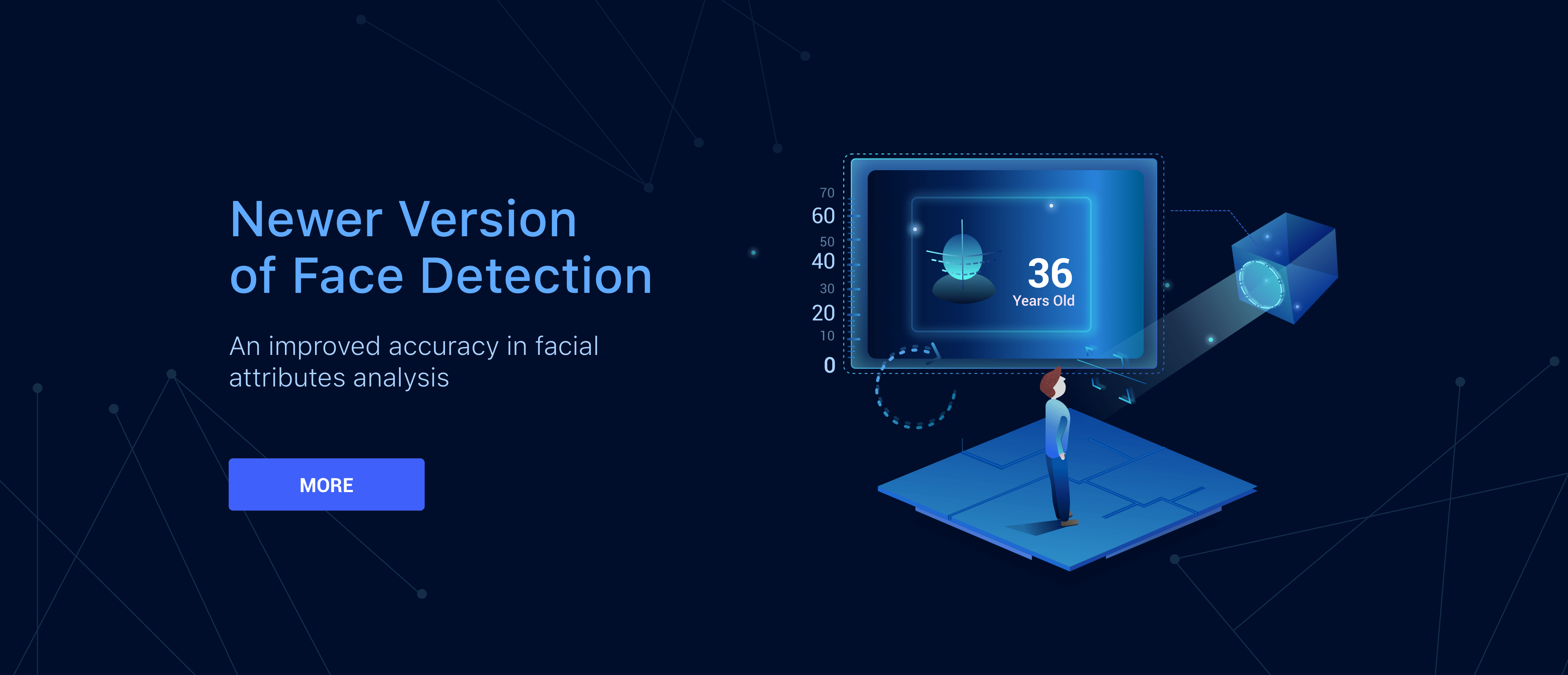
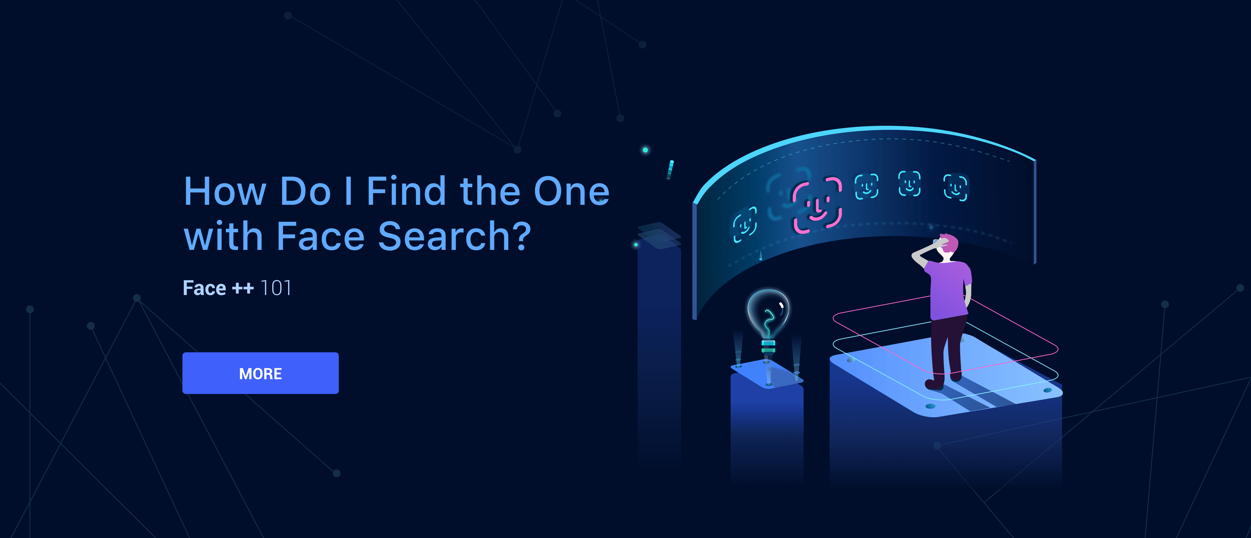
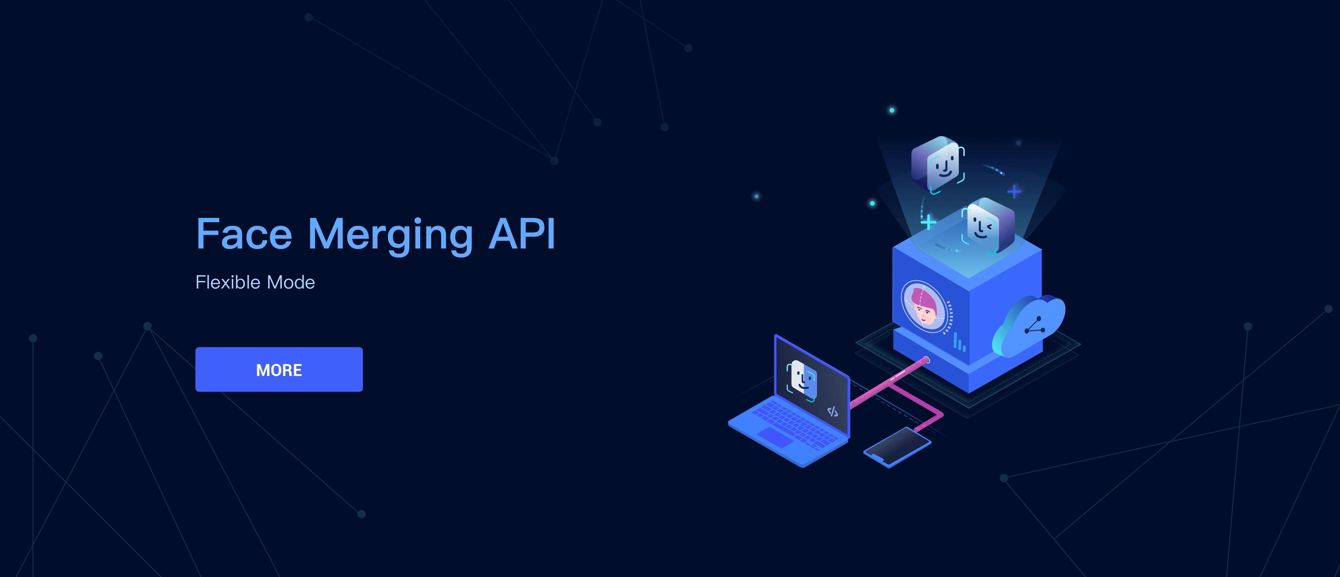
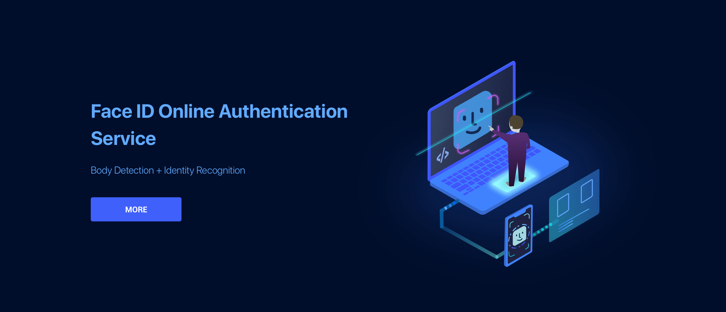
I worked iteratively with content, brand and marketing teams to create an extensible visual system that works well with our company. Here’s parts of banner design which are created for Face++, both used in web and mobile devices - all with the goal of elevating the product’s digital presence.
Based on existing main dark color (#000E2B) as background to add scientific but vivid style,in the meanwhile express the similar meaning for abstract business events.
When we imagine the scientific and AI, these words always came out to my mind, such as “transparancy”, “metallic”, “dark blue” ,etc. To emphasis the sense of scientific, I choosed different blue style and combined with purple to balance the banner style more suit for website

To make mobile web interaction and visual more intuitive, I redesigned and optimized a part of it. Combining some AI style illustrations to make it works better on the mobile. I change the visual in a clear way and as Apple Developer as reference. Personally, I put Apple offical website first as my reference source, because Apple interaction way sometimes are similar with our product in UI.
After that I learned more constraints of UI design for mobile webs, such as how to keep visual clean to put abundant information and data in a limited space and how to make the interface looks formal and official.


Megvii are developing competing facial revognition platforms powered by artificial intelligence. Its main product is Face++, a platform that can detect faces and confirm people’s identities with a high degree of accuracy.
Thanks to all of my colleagues’ guidance and help to make me collaborate with our team in a comfortable way!